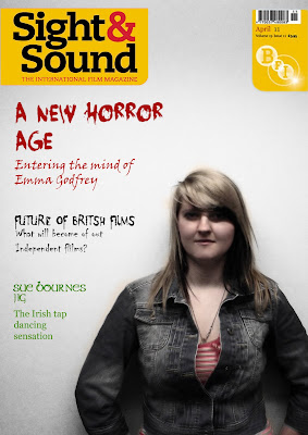
I think this magazine follows the conventions of Sight & Sound as their background tends to have a gradient effect. The photo came out great as it automatically had that effect so i didn't need to apply it. The typography fits perfectly with the content its discussing, such as the blooded typeface for the Horror subject and the green typeface for the Irish movie. I'm very pleased with this result as i find it hard to follow the conventions of an existing magazine, yet it would be harder to start one from scratch. The composition of the director is perfect as i tried to follow one that had this lay out, there wasn't much text and the main focal point was the director himself. But the colours were very faded. I also like how the red from the font at the top leads down wards to the t-shirt, it's really effective as red is the most eye catching colour and having the 'Horror' section in red and the director wearing a bit of red suggests that they both link and there's a relation to the two.
No comments:
Post a Comment