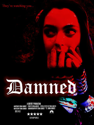
 I'm very pleased with the final result as it successfully look like a horror film poster. It has one focal point, it contains a blood like red, and the typography is relevant to the story of the film also the credits at the bottom emphasis the feel of a film poster. I like how not all of the picture it red, this could suggest that there is more danger than safety as 2/3 of the picture is red. I like how there's a smokey effect behind the picture, this createsan eerie atmosphere towards the picture and may tell the audience that theres some creepiness to the film. The compositioning of the picture is perfect as it creates a more interesting effect as it isnt in the centre of the page. I'm very pleased with the poster and feel it follows the conventions of a film poster, especially a horror.
Sunday, 3 April 2011
Final Poster
 I'm very pleased with the final result as it successfully look like a horror film poster. It has one focal point, it contains a blood like red, and the typography is relevant to the story of the film also the credits at the bottom emphasis the feel of a film poster. I like how not all of the picture it red, this could suggest that there is more danger than safety as 2/3 of the picture is red. I like how there's a smokey effect behind the picture, this createsan eerie atmosphere towards the picture and may tell the audience that theres some creepiness to the film. The compositioning of the picture is perfect as it creates a more interesting effect as it isnt in the centre of the page. I'm very pleased with the poster and feel it follows the conventions of a film poster, especially a horror.
Subscribe to:
Post Comments (Atom)
No comments:
Post a Comment