In what ways does your media product use, develop or challenge forms and conventions of real media products?
I would think that my trailer uses the conventions of a real media product, as it contains the typical horrific music in the background like a normal horror trailer does. It sets the atmosphere immediately informing the audience the genre of the trailer. The trailer also has the uses the conventions as you don't know what is happening and is not sure on the plot line but knows who the characters are and the setting. This gives the sense of a horror film as within the film you don't know what's going to happen, and at the beginning you don't know what's going on which is exactly what this trailer is doing. In Horror trailers, the majority of them tend to have a climax and build up and the pace tends to speed up, my trailer does this exactly, i used this idea as i think its very effective to have it calm and slow then the pace quickens creating fear and hearts racing, reflecting the characters emotions within the film. Also as i have researched trailers and there effects and use of angles, i have tried to put some into practise but have some of my input into it to interpret it differently. In the trailer with the three boys heading towards the camera, the boy on the far left seems to jump further and appears to walk faster than the other two. I decided to do this idea as it gives a scary sense that when you turn your back on some and look back at it, it seems to have jumped closer towards you, giving a sense that you shouldn't take your eye off the monster as you don't know what'll happen, this immediately emphasises the use of conventions as in some trailers there's always a point-of-view shot where the protagonist is trying to find the monster but has no idea where, this then gives the idea that my trailer is trying to make people see the trailer through the eyes of the protagonist and feel her fear and emotions. There is also another scene at the end where there is a 180 degree shot around the girl with shots of the boys cutting in, this scene is to show that she is thinking of them and they are her main concern and is scared of what is going to happen.
Yet you could say that this film has a slight independent feel to it as it doesn't have the dark contrast as a normal mainstream horror movie does. This could be relevent to the movies 'Shaun of The Dead' and 'Colin' as both of these do not have a large budget. So my film can be seen as challenging the conventions, yet some independent movies do not challenge them so that isn't always the case. I think in general my movie does use the conventions as sometimes if you try and challenge them you will not know if the audience will like it, where as if it does follow the conventions they are more likely to watch it as they know what to expect.
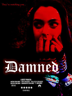
My film poster does follow the conventions as most of the horror poster have a black/dark background with some hint of red to resemble the danger or blood spillage within the movie, i wanted to follow the conventions with the poster especially as it always looks very effective and the use of red is the most eye catching colour there is, so this immediately attratcs the audience and tells them what genre it it. Most posters tend to have the title in the centre, immediately wanting the audience to know the title and try to draw them in. With the layout of my poster doesn't really apply the conventions of this as it's in the last 3rd down on the poster, but i've used red from top to bottom to lead the eye down which i believe is effective, as they see the tag line first then the picture then the name. I feel this layout gives the idea of a build up of fear.
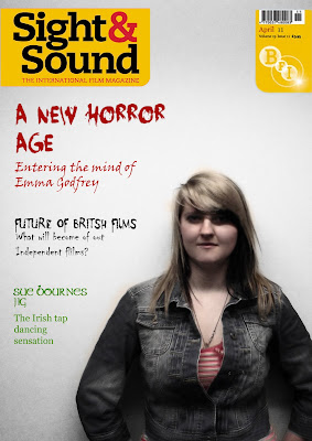
My frontcover magazine does follow the convention as i've used an existing magazine to promote my film. I used Sight&Sound as they tend to have independent film reviews, i also chose this magazine as it is an easier way to follow the conventions and the style as i can look at past magazines to take references of how to layout a cover on the genre of horror. Also what they tend to use for a focal point either the director or the main character, i feel i followed the conventions of the magazine front cover well. They generally have a gradient background which i managed to achieve and also have font/colour relevent to the topic it was discussing. Overall i feel my magazine successfully uses the conventions of a magazine cover and looks like one.
Friday, 29 April 2011
Monday, 25 April 2011
Finished 'Damned' Trailer
This is the final edited version of my trailer, i'm very pleased with the result as it doesn't give away the plot to the audience nor the storyline, which tends to happen in horror trailers.
Sunday, 17 April 2011
Magazine Front Cover

I think this magazine follows the conventions of Sight & Sound as their background tends to have a gradient effect. The photo came out great as it automatically had that effect so i didn't need to apply it. The typography fits perfectly with the content its discussing, such as the blooded typeface for the Horror subject and the green typeface for the Irish movie. I'm very pleased with this result as i find it hard to follow the conventions of an existing magazine, yet it would be harder to start one from scratch. The composition of the director is perfect as i tried to follow one that had this lay out, there wasn't much text and the main focal point was the director himself. But the colours were very faded. I also like how the red from the font at the top leads down wards to the t-shirt, it's really effective as red is the most eye catching colour and having the 'Horror' section in red and the director wearing a bit of red suggests that they both link and there's a relation to the two.
Thursday, 7 April 2011
Photos for Magazine cover

The pictures i originally wanted to use for the magazine front cover weren't as sharp as Sight and Sound pictures. I also considered one of the front covers which contained a director, the background was plain and simple, a great idea not to distract the eye from the main focal point, making him the important person emphasising his position.

I like this picture as when a person looks directly into the camera lense, it sometimes suggests a sense of intimidation to the audience, or the sense of 'i'm not afraid of anything'. I might use this picture but im not to sure on the lighting near the eyes, it could suggest the genre in which the director likes to use, yet in the photos from Sight and Sound, the lighting in very clear, showing all aspects of the persons face and every detail.
This is the same concept for the photo above, its a usable picture but im not to sure about the lighting around the eyes.
I like the idea of the director looking to the side given their image an 'edgy' style, but if im following the house style of Sight and Sound, the majority of the photo's tend to look at the camera.
I woulnd't use this picture as it is slightly out of focus in a section of the photo, and the general positioning doesn't look right.
The lighting on the eyes is a lot better, but to me the image doesn't look as sharp as the previous photos do.
Sunday, 3 April 2011
Final Poster
 I'm very pleased with the final result as it successfully look like a horror film poster. It has one focal point, it contains a blood like red, and the typography is relevant to the story of the film also the credits at the bottom emphasis the feel of a film poster. I like how not all of the picture it red, this could suggest that there is more danger than safety as 2/3 of the picture is red. I like how there's a smokey effect behind the picture, this createsan eerie atmosphere towards the picture and may tell the audience that theres some creepiness to the film. The compositioning of the picture is perfect as it creates a more interesting effect as it isnt in the centre of the page. I'm very pleased with the poster and feel it follows the conventions of a film poster, especially a horror.
Subscribe to:
Comments (Atom)


