Tuesday, 3 May 2011

Evaluation 4

'How did you use new media technologies in the construction and research, planning and evaluation stages?'


Most of the technology which has enabled me to create my magazine front cover, poster and trailer i am familiar with, yet because i had to create a film trailer as well, i was put up against software which i have never used before and i felt were quite challenging.


I am familiar with photoshop, so the creating of my cover and poster wasn't to hard. Yet some bits were very tricky to achieve such as having a blood splat over her face but still able to see the protagonist face, having the focal picture on the cover being coloured in yet the background desaturated. I had to learn a technique called 'Layer Mask' which enables me to bring a picture from behind another forward, which gave me the effect of the blooded face.


I have used Blogger for my AS level, so i know how to function it well. I had some difficulties on how to upload videos and how to embed a link. Once i found out it wasn't as difficult as i thought it was, but sometimes finding the links on Youtube for the trailers wasn't easy to find.



I have used Youtube before to find certain videos, finding the trailers i needed wasn't very difficult. I have never had a Youtube account before, and it was hard to upload my video and get a link for blogger, but other than that it was easy to use.


Premier Elements wasn't familiar with me, but it didn't take long to pick up the aspects of it, it wasn't hard as i knew what i wanted from looking at different trailers. The use of fade in and fade outs, jump cuts and polarising some of the frames, effectively created a more horrific effect. Sometimes i was stuck with it rendering, as sometimes it kept coming up with error, but it didn't take too long to sort out. Also trying to figure out how to take the digested sound within the shot out and put the music i created in it's place.


Fruity loops had to have been the hardest to use, it was very useful as it contained different instruments and enabled me to come up with rhythms. I used this alongside Audacity as i created a bar of music in Fruity Loops and put them all together in Audacity. Fruity Loops was great to work with once i got the hang of it, the ability to change tempo the pitch of each individual instrument, like creating my trailer, from watching trailers i had a rough idea of what sound track to had, and once my film trailer footage was completed it was easy to work off it.



Audacity enabled me to finish off the music, refine it to make it sound smoother and ran through sufficently. In Fruity Loops the pitch could only go so high and so low, but with audacity i had more variety between the pitch, i could also layer it with other rhythms i created so one piece could flow nicely from one to another. At the near end of my trailer there is a section of music as though it is going backwards which i thought was rather effective and i couldn't do it in Fruity Loops but i was able to do it Audacity.


Overall i couldn't use one Software with out the other, they all managed to help me to create my media products effectively and i am pleased with what i have achieved. It has helped me with research as i was able to go on Google and Youtube to research the layout of poster/Magazine frontcovers and the functions they poses to hopefully achieve a successful piece, and with Youtube the ability to find trailers to help me construct an idea for my trailer. With the planning i created a mindmap of ideas from the trailers i had watched with a moodboard, also i created a moodboard of various pictures to help me think in depth what a horror movie consists of.
Evaluation 3

' What have you learned from your audience feedback?'


The response from my audience feedback was very helpful, as i know my strong points about each product and the downfalls. The overall was positive which has shown that the target audience has been hit and what i wanted to achieve has been done successfully.
My audience ranges to 16-25, i originally chose this age range as this tends to be the typical age of wanting to watch a horror/thriller movie, other age ranges would be put off.
It is like an ordinary film, but i feel the trailer does pull people in as it shows like a normal horror, but if you saw the actual film it wouldn't be quite would you thought.

I didn't want a questionnaire as i feel people wouldn't be able to express there full feelings towards each product properly and it would be narrowed down, i told them loosely questions like 'If this product works, why?' 'Does this appeal to you?' 'What could be improved?'


Feedback:

Poster: The positive feedback i got from people was
-The layout of the poster was effective
- The colours were vibrant yet disturbing
- The focal photo intriguing as you are not sure what has happened to the girl
- A couple of people had said it did look like a poster as it had the 'functions' such as the credits at the bottom.

I had a comment saying they weren't appealed by the poster as they had no idea of what it was about.


Magazine:
Unfortuately the magazine front cover wasn't as successful as the poster, some had said that it didn't look like a magazine, yet more like a poster. Some had stated that the photo should have been moved up a little higher. Yet on the other hand they had said i had a good understanding of making a magazine cover and the use of article titles were appealing.

Trailer:


There was a lot of positive feedback for the trailer, such as the music was well fitted with the genre and had actually scared them. Some had said it was intriguing and would go to the cinema to watch it.
The use of scenery and clothing was appropriate with the genre especially the graveyard as it emphasises

Evaluation 2

'How effective is the combination of your main product and ancillary texts?'


Throughout my products there is a sense of similarity between the three.

With my magazine and poster i've used red significantly, not only for it being a horror movie but to lead the eye through each one, i feel these two are very effective as you can see the technique through both, plus the composition is the same as i have positioned the focal points on the right hand side, this immediately shows a link to both. Though the magazine front cover does to me stand out like a sore thumb, with the trailer and poster they typically portray a terrifying atmosphere with the music in the trailer and use of special effects and a picture with 'blood' upon the focal point both equally reflect a horror genre.

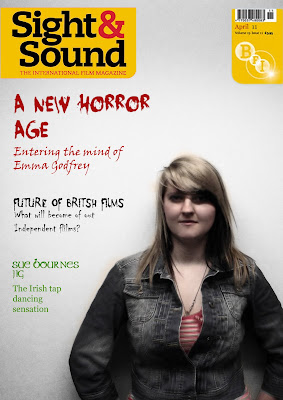
Yet the front cover doesn't appear to be scary, yet i had a thought that there could be a good reason why i have choosen to do it this way. Sight&Sound tend to review in an intellectual style which appeals audiences to read behind the actors/actresses/directors feelings and intentions on the movie. The use of a young person instead of a usual older person appearing on the front cover could suggest that the people who create movies are ultering so that a normal person can create a movie which appeals to everyone, instead of you typical big name director creating your gruesome expensive horror movie. Also instead of having the front cover being bloody like my poster, having it plain and normal may suggest that this magazine is going to see the other side of the creation of the movie, behind the scenes of what makes this movie significant to be choosen by Sight&Sound to be reviewed and what's so important to have a younger director.

I feel that they are all effective in there own individual way, even though the front cover doesn't obviously show that it's promoting a horror movie, from it being completely different it sort of stands out more suggesting that people are more keen onto why it isn't the same as the trailer and poster.

I think if i were to re-do my magazine frontcover i would have the title of the movie in the typeface which i originally created for my poster and trailer to atleast give it some of a link between them. Having it on the frontcover in large would immediately draw the eye, but have the rest of the text in another typceface to make the title stand out more, i would change the focal point as well, making the frontcover more appealing, possibly a closer view point from midwaist up. Giving a more intense feel as though it's personnal as we are going to explore the intention of the director.

Friday, 29 April 2011

Evaluation 1

In what ways does your media product use, develop or challenge forms and conventions of real media products?


I would think that my trailer uses the conventions of a real media product, as it contains the typical horrific music in the background like a normal horror trailer does. It sets the atmosphere immediately informing the audience the genre of the trailer. The trailer also has the uses the conventions as you don't know what is happening and is not sure on the plot line but knows who the characters are and the setting. This gives the sense of a horror film as within the film you don't know what's going to happen, and at the beginning you don't know what's going on which is exactly what this trailer is doing. In Horror trailers, the majority of them tend to have a climax and build up and the pace tends to speed up, my trailer does this exactly, i used this idea as i think its very effective to have it calm and slow then the pace quickens creating fear and hearts racing, reflecting the characters emotions within the film. Also as i have researched trailers and there effects and use of angles, i have tried to put some into practise but have some of my input into it to interpret it differently. In the trailer with the three boys heading towards the camera, the boy on the far left seems to jump further and appears to walk faster than the other two. I decided to do this idea as it gives a scary sense that when you turn your back on some and look back at it, it seems to have jumped closer towards you, giving a sense that you shouldn't take your eye off the monster as you don't know what'll happen, this immediately emphasises the use of conventions as in some trailers there's always a point-of-view shot where the protagonist is trying to find the monster but has no idea where, this then gives the idea that my trailer is trying to make people see the trailer through the eyes of the protagonist and feel her fear and emotions. There is also another scene at the end where there is a 180 degree shot around the girl with shots of the boys cutting in, this scene is to show that she is thinking of them and they are her main concern and is scared of what is going to happen.

Yet you could say that this film has a slight independent feel to it as it doesn't have the dark contrast as a normal mainstream horror movie does. This could be relevent to the movies 'Shaun of The Dead' and 'Colin' as both of these do not have a large budget. So my film can be seen as challenging the conventions, yet some independent movies do not challenge them so that isn't always the case. I think in general my movie does use the conventions as sometimes if you try and challenge them you will not know if the audience will like it, where as if it does follow the conventions they are more likely to watch it as they know what to expect.

My film poster does follow the conventions as most of the horror poster have a black/dark background with some hint of red to resemble the danger or blood spillage within the movie, i wanted to follow the conventions with the poster especially as it always looks very effective and the use of red is the most eye catching colour there is, so this immediately attratcs the audience and tells them what genre it it. Most posters tend to have the title in the centre, immediately wanting the audience to know the title and try to draw them in. With the layout of my poster doesn't really apply the conventions of this as it's in the last 3rd down on the poster, but i've used red from top to bottom to lead the eye down which i believe is effective, as they see the tag line first then the picture then the name. I feel this layout gives the idea of a build up of fear.


My frontcover magazine does follow the convention as i've used an existing magazine to promote my film. I used Sight&Sound as they tend to have independent film reviews, i also chose this magazine as it is an easier way to follow the conventions and the style as i can look at past magazines to take references of how to layout a cover on the genre of horror. Also what they tend to use for a focal point either the director or the main character, i feel i followed the conventions of the magazine front cover well. They generally have a gradient background which i managed to achieve and also have font/colour relevent to the topic it was discussing. Overall i feel my magazine successfully uses the conventions of a magazine cover and looks like one.

Monday, 25 April 2011

Finished 'Damned' Trailer


This is the final edited version of my trailer, i'm very pleased with the result as it doesn't give away the plot to the audience nor the storyline, which tends to happen in horror trailers.

Sunday, 17 April 2011

Magazine Front Cover


I think this magazine follows the conventions of Sight & Sound as their background tends to have a gradient effect. The photo came out great as it automatically had that effect so i didn't need to apply it. The typography fits perfectly with the content its discussing, such as the blooded typeface for the Horror subject and the green typeface for the Irish movie. I'm very pleased with this result as i find it hard to follow the conventions of an existing magazine, yet it would be harder to start one from scratch. The composition of the director is perfect as i tried to follow one that had this lay out, there wasn't much text and the main focal point was the director himself. But the colours were very faded. I also like how the red from the font at the top leads down wards to the t-shirt, it's really effective as red is the most eye catching colour and having the 'Horror' section in red and the director wearing a bit of red suggests that they both link and there's a relation to the two.

Thursday, 7 April 2011

Photos for Magazine cover


The pictures i originally wanted to use for the magazine front cover weren't as sharp as Sight and Sound pictures. I also considered one of the front covers which contained a director, the background was plain and simple, a great idea not to distract the eye from the main focal point, making him the important person emphasising his position.

I wouldn't use this picture as it is too blurry and the positioning isn't right.


I like this picture as when a person looks directly into the camera lense, it sometimes suggests a sense of intimidation to the audience, or the sense of 'i'm not afraid of anything'. I might use this picture but im not to sure on the lighting near the eyes, it could suggest the genre in which the director likes to use, yet in the photos from Sight and Sound, the lighting in very clear, showing all aspects of the persons face and every detail.


This is the same concept for the photo above, its a usable picture but im not to sure about the lighting around the eyes.


I like the idea of the director looking to the side given their image an 'edgy' style, but if im following the house style of Sight and Sound, the majority of the photo's tend to look at the camera.


I woulnd't use this picture as it is slightly out of focus in a section of the photo, and the general positioning doesn't look right.


The lighting on the eyes is a lot better, but to me the image doesn't look as sharp as the previous photos do.


This is the same as the photo before, too blurry and not in focus as i hoped it to be.


The lighting is a lot better, i like the background as the gradient effect looks really good and is more interesting.


I wouldn't really use this photo as the hair is covering up the face